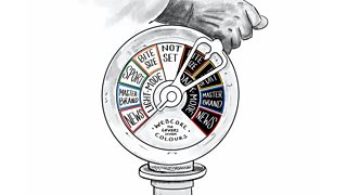
A short history lesson
BBC GEL is the design framework for the BBC and was one of the very first design frameworks to be published online back in 2010. GEL sets out guidelines to allow UX designers working on the different sections of the BBC website to create a consistent user experience and visual identity. This was fantastic as a set of guidelines for designers and developers to follow when creating websites for BBC Sport, BBC News and BBC Bitesize (to name just a few). Plus, all the other experiences for mobile apps and TV.
However, as Matt talked about in his recent blog post about moving to the cloud, we've been going through a cultural change in the BBC. We're not building separate websites under one domain name any more. Through the WebCore project, we're now building one website. And one key part of that is the design system.
Design systems are the single source of truth for both the design and implementation of a digital product, whether that's a website or app. GEL can now be injected into the design system instead of being left to interpretation by teams reading and digesting the guidelines.
While there's plenty of design systems which are only built for one brand, ours has to serve a wide variety of destinations at the BBC. Destinations are the places which people come to the BBC to visit and they have to feel different to each other. There are informative destinations like News and Sport but also more playful ones like CBBC and CBeebies. This is tricky to do in a structured design system. And it's something we're learning to do best as we go.
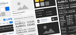
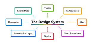
Our design system is split into five areas:
- Foundations. Basic tokens like font sizes and spacing units.
- Components. These range from simple UI snippets like a button to complex ones like a navigation bar. Each component has accessibility and reusability considered from the first iteration.
- Layout components. Special components with a specific job to arrange other components in a layout, like Grids, Sidebars and the humble Stack.
- Levers. The theming system. There are three levers (so far) in the design system: the font palette, the core colour palette and the brand colour palette. We want more levers. More on this later.
- Containers. The top-level components that assemble other components together and fill them with data to form a stand-alone experience that can be used on a page. For example, the Article container fetches the article content from the business layer, and assembles the Heading, Tag List, Rich Text and Image components to make an article.
Our community in BBC Design + Engineering have been building up the design system for over a year now, and we want to share with you the lessons we've learnt in that year.
1. Make it as easy as possible to share
We've taken a very different approach to the GEL design system compared to others out there. Our team, the Presentation Layer team, are not the sole maintainers of the design system. We haven't pre-anticipated requirements and made in-advance a library of components like buttons, input boxes, navigation bars and dialog boxes. We haven't created the design system as a versioned library that developers need to pull into their project and keep up-to-date.
So what have we done instead? We've done three things:
- The Presentation Layer, our React-based rendering layer for the new BBC website, is a monorepo that includes the design system. Only web pages created in the monorepo can use the design system. And, most importantly, any changes to components in the design system are rolled out instantly.
- Layouts, Components and Tokens are only created when they are needed. We typically wait until there are at least two use-cases for a component before creating it. We didn't even have a Button component until a few months into the project!
- Our team does not solely own the design system. Every team building with the design system jointly owns it. Working together as a community, we all build and make changes to components.
By doing these three things, every page is always using the up-to-date version of the design system and using it consistently. The design system does not stand alone. It's built into the wider platform. So it's not possible to build something bespoke to a particular team's needs; everything can be shared.
2. Do things on a need to make basis
We intend to build the one BBC website together because previous approaches have led to fragmented results. Therefore, a top down approach of 'we build these things and you use them' doesn't play nicely with this way of doing things. It shouldn't be down to one central team to create the components all teams will eventually use. Our product teams do their own user research, so they know much more about how the audience are using BBC products and services than our team does. They're the ones best placed to create new components and improve what we already have available.
We knew this approach was going to be difficult. Teams across the BBC are used to working in silos with autonomy to create components and features to meet their own needs whilst using the GEL guidelines as a steer. We're essentially pressuring a move from vertical silos to horizontal shared ownership through the design system. Any new additions to the design system should be considered by how anyone might end up using them.
Because of this culture change, we're striving to keep the components simple to start with. Remember that this design system has to serve multiple destinations at the BBC. If we start with something complicated then it's only going to get more complicated and unmanageable by the time we've figured out how it can be used by everyone.
Keeping things simple means to avoid making components until they're needed. In some cases it also means to not make them with all the bells and whistles until it becomes a requirement to do so. This allows us to avoid complicated discussions and move forwards in the short term.
We're there to join the dots between all those other teams creating stuff in the design system and offer guidance and support in building and improving components. We create the standards and principles for all teams so that we can make sure accessibility, reuse opportunities and consistency are at the heart of what everyone makes.
3. The reinvention of the wheel
Prompting teams to find and use solutions already in the design system can be challenging. It's something we've had to tackle whilst teams are getting acquainted with the design system.
There are some products at the BBC with well-established online experiences which are now rebuilding in the cloud using the design system. This can bring along with it a like-for-like mentality. Some teams (but not all) expect to create a carbon-copy of their existing experience using the design system.
There's a whole array of articles out there which cover a topic of "what happens when a design system gets you 90% there" - these are our experiences on the subject. We know design systems are fundamentally driven by re-use. Creating something new which is similar to another pattern or component inside the library can add unnecessary weight, take up lots of designers and developers time in creating those new components and cause confusion in the future with those looking to find the right component for their needs.
We've been building things in isolation for years at the BBC, it's sometimes hard for teams to think outside of their silo and horizontally about what the business needs in a component library. The design system, and the Presentation Layer Team are now influencing teams to think more horizontally. A simple tactic we employ in these circumstances is to ask the teams "what problem are they trying to solve?". This flips the priority of "we need this" to "a user needs to be able to do this". We try to approach each new request for a component with a re-use first way of thinking. By doing this, we're setting an example for the rest of the teams building using the design system.
We can then have a conversation around the existing components available and potential iterations which all teams could benefit from. If we do find that there's a requirement for a new component - we work with that team to build it with reuse considered. It's easy to spot the same problems in different areas on our radar. We then join the dots, and get the relevant teams involved to help everyone work more collaboratively.
4. Be strict to allow for flexibility
To drive re-use, we need to be able to create components once; not multiple times for each of the different brands. So, to support the variety of destinations on the BBC website, we came up with a theming system we call 'the levers'. Anyone creating a page can choose from a set of font combinations and colour swatches to theme it. And each component will work with all of them out-of-the-box.
A theming system might not seem like a ground-breaking idea, but it's pretty powerful when BBC News leadership ask, 'When can you get this video player page on the BBC Sport website ready to use on News as well?' and we call pull some levers and say, 'Hey presto - it's already done!'
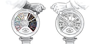
To make this work, however, we needed to be strict about what sets of colours and fonts are allowed to be used in Components. We had to resist the temptation to use our own colours in specific places.
Colours and fonts are given 'semantic' names based on where they're intended to be used, rather than what they look like. For example, the text for heading text is called 'primary' and the colour for borders is called… you guessed it… 'border'!
That doesn't mean they're set in stone, though. We've already had to add new colours and change them as we get newer use-cases, and we hope to add more levers in the future too. How great would it be to have different levers to change the type of motion applied to an experience? Or to help us create fantastic children's experiences where there may be crazily different requirements for a website to cater for those types of audiences.
5. Documentation is hard, but important
One thing we always worry about is our documentation. We have a lot of it: accessibility guides, design guides, development guides, tutorials, component docs, principles, values… And to make matters worse, they're all over the place: on our internal wiki, in our cloud storage, on GitHub and in Storybook.
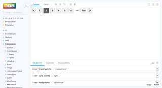
Building a successful Design System and platform hinges on the quality of the documentation. It needs to be kept up-to-date. It needs to be discoverable. It needs to be easy to navigate.
Just like with components, documentation can start off simple but grow unwieldy as people add to it bit-by-bit. Taking the time to audit it, get feedback and clean it up is really important. That's something we're doing at the moment.
The Presentation Layer team duties are part design system curation and part support team. Having a complete and well organised set of documentation means we can run a tight ship. It helps us to automate a lot of support requests for both designers and developers.
6. Design for longevity through obsolescence
Finally, the Design System has got to be fit for the future. By designing our content and layouts as components, it's easy to rip them out and replace them when the time comes. And we shouldn't be afraid to do that!
Intrinsic Web Design is becoming a hot topic in the world of web design. As we start to embrace newer features of CSS like Grid and intrinsic sizing units, it will be easy for us to swap out our existing layout components with something more intrinsic.
We hope to talk more about Intrinsic Web Design in a future blog post.
It's been over a year of designing, building and learning as we go. Above all, we've learnt that we need to be flexible as we work together with everyone from different teams. The progress that's been made so far has been brilliant, and we're excited about building on the foundations we've made to make experiences that our audiences will love.
This article is also featured on the BBC Design and Engineering Publication on Medium and the BBC Internet Blog


